Data Visualization has been playing an important part in understanding data in any data science projects. The way we present our visualization will determine how the audience will comprehend the data that we would like to present. A famous idiom when it comes to data visualization
“A picture is worth a thousand word”
— Fred R. Barnard
It is obvious that a picture will tell various stories that can prompt us able to understand the data. Without a proper picture, It is quite hard to explain things in a proper manner. It is always a good idea to put a good visualization when explaining data. Hence, I will give a handful of data visualization plots by using Matplotlib and Seaborn that will WOW your partners or clients when presenting data in a simple yet professional way. For the purpose of making the visualization, I used the Seoul Bike Sharing Demand DataSet that can be downloaded in UCI Machine Learning Repository. It consists of 8760 observations and 14 features. You can take a look at the notebook provided to know more about it.
Scatter Plot
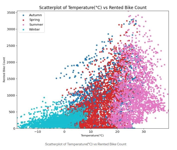
A scatterplot is one of the plots that can detect the correlation between two variables. We often see this visualization in many data-related conferences. We can see whether the increase of a variable can influence the increase or decrease of another variable. You can see on the plot above that the higher the temperature, the higher the rented bike count at the peak at 3000–3500 bikes. This visualization also indicates that summer has been the most used bike compared to other seasons. You can play with the code to produce the visualization by looking at the code here.
Bubble Plot with Encircle
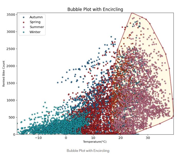
Bubble Plot with encircling is one of the most useful plots that I find quite interesting. it could show some important values in our visualization by encircling the data. You can see the plot above where summer is the most important part for the highest demand for renting bikes. It could make us easier to explain to the stakeholders which part of our data shows the most significant demand that could produce a profit or how many bikes should we provide if the same season occur again to anticipate the lack of bike. You can play the code to produce the visualization by looking at the code here.
Marginal Histogram
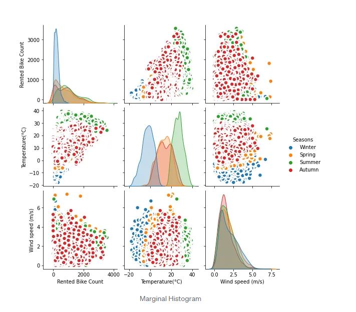 A marginal Histogram has been considered to show the correlation among all features that we have in data frame/CSV files. We can plot all correlations by carrying out a seaborn method that can plot all the correlations among features. The drawback of this type of visualization is that we have many features. It will create a lot of correlations plots that are not a good idea to be carried out. It is better to use visualization when we have only a handful of variables that can map into a better visualization. You can see in the code where I merely put a few features to be visualized in order to avoid a lot of plots. Sometimes, it is better to visualize between variables that we are interested in rather than plotting all correlations among them.
Time Series Plot
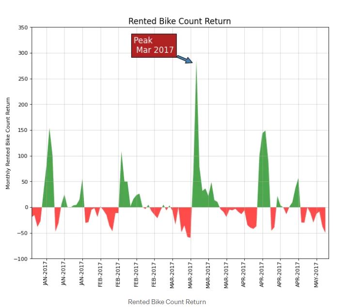 Time Series Data is everywhere. The way to plot it is essential in order to get an idea about the data. You can look at the data visualization above where i compared the Monthly Rented Bike Count Return and show that Mar 2017 is the most used bike compared to other months. Giving context by annotating the specific data will also make the audience understand the data better. It is recommended to do this. However, Do not annotate too many annotations because it can affect the visualization that we will present. Make it simple yet professional to present.
Order Bar Chart
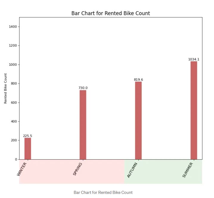 A bar chart is one of my favorite plots when I want to rank the data between categorical and numerical features. The usual way to plot a bar chart in matplotlib is not quite interesting. We have to think creatively in order to change the visualization by using a handful of methods available in matplotlib. You can check where I use the patches module available in matplotlib to change the bar size and annotate the bar size based on the rented bike count for each season. You can check the code again whenever you would like to implement this type of visualization. Based off the visualization above shows where summer has the most used bike.
Lolipop Bar Chart
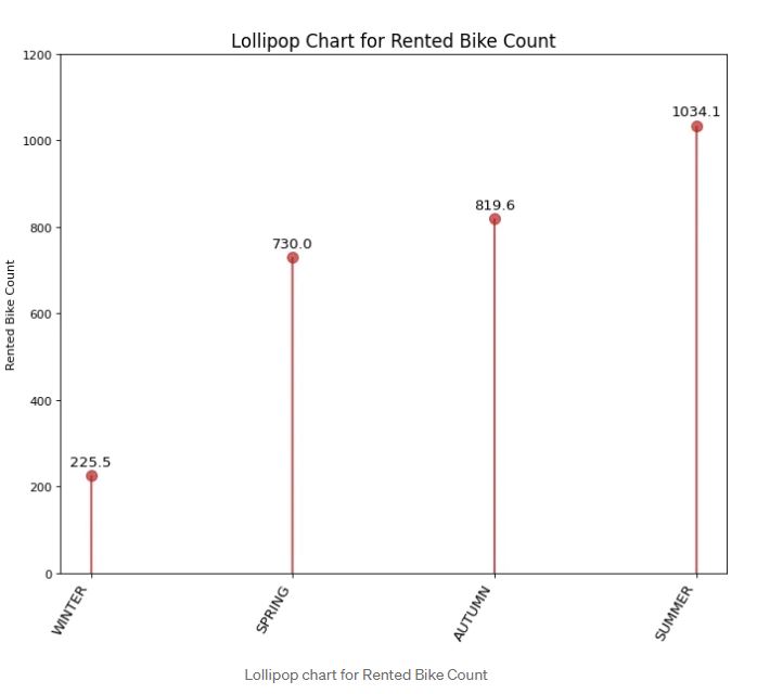 Lollipop Bar Chart is similar to a bar chart. The comparison is merely the size of the bar and the additional lollipop to emphasize the size of the bar. For our case looking at the visualization above shows that winter has the least rented bikes at around 225 bikes followed by Spring and the most used bike is Summer with 1034 bikes. Sometimes, It is an individual’s taste to choose either a lollipop chart or a bar chart. I often change the bar chart to the lollipop chart and vice versa.
Density Plot
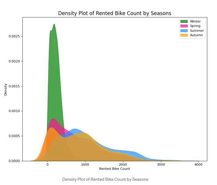 A density plot is used to visualize the distribution of numerical features. You can see the most available data by looking at the data distributed in this plot. You can see the plot above where the distribution of Rented Bike Count among various seasons. The data shows that most data in Spring, Summer, and Autumn are quite scattered around from zero to 3000 bikes rented whereas Winter data are around from zero to 1000 bikes rented.
Density Plot with Curves
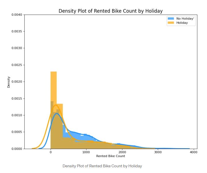 Density Plot with Curves brings together collective information by two plots so we can have them both in a single figure instead of two. You can see the plot above where the plot of Non-Holiday and Holiday plots of Rented Bike Count is joined to yield one visualization. You can give different colors to present them in an understandable way. You can play the code at the given link.
Box Plot
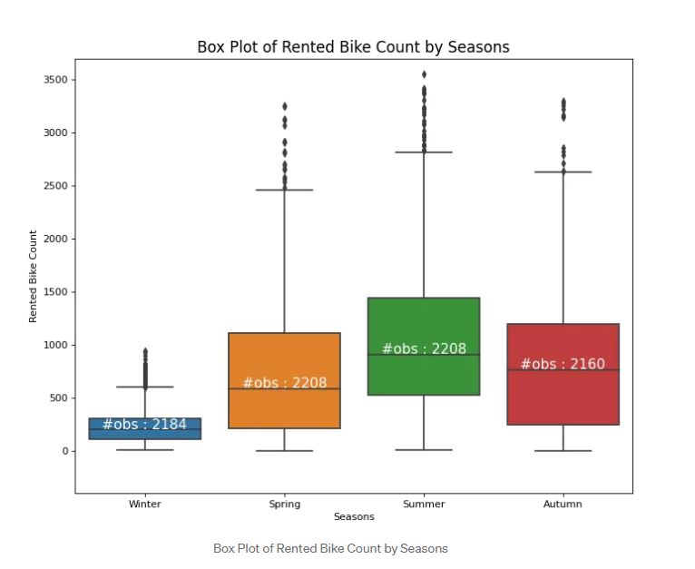 Box plot is used to know the spread of our data. We usually use a boxplot to compare categorical features and numerical data. The Box plot is divided into a few parts namely the middle part(mean), lower quartile, upper quartile, and outliers. Outliers are data that are outside of the lower quartile and upper quartile. You can check here for further explanations. In the Box plot, It is a good idea to annotate the observations to catch a better visualization for the audience as you can see in the plot above. You can see that there are 2184 observations during Winter.
Pie Chart
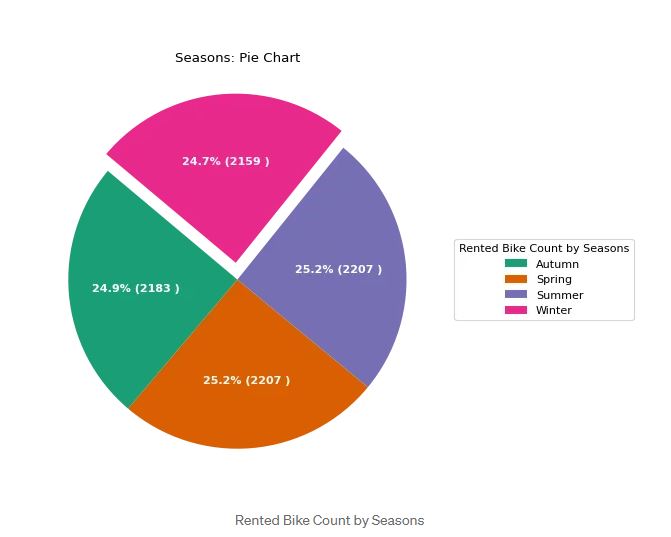 A pie chart is one of the easiest ways to interpret. You can plot the data by carrying out a pie chart by comparing numerical data and categorical features. You can see the plot above where There are 2156 bikes rented in Winter or 24.7%.
Time Series with Error Bands
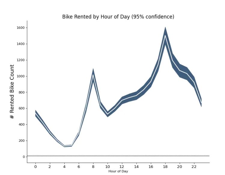 A Time Series plot with Error Band is used to visualize multiple observations among each data point. Based on the plot above, you can see how many bikes are rented by the hour. The mean of the number of rents is denoted by the white line and 95% confidence bands are drawn around the mean.
Parallel Coordinates
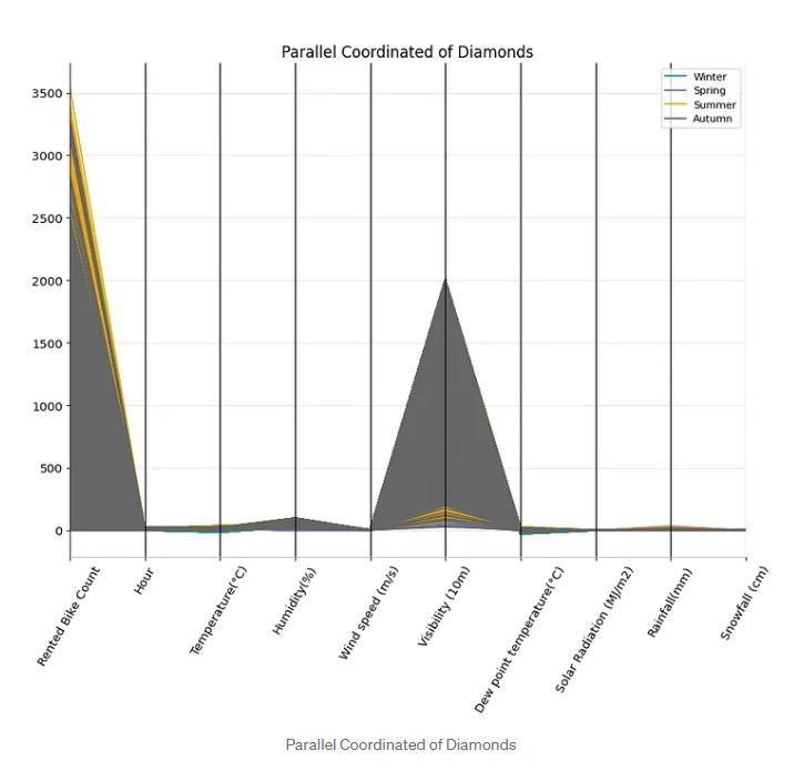 Parallel Coordinates is still a new plot for me. I find this plot quite interesting to uncover patterns among all the data to check whether there is a cluster among the data. You can implement Parallel Coordinate by using pandas as coded in the given notebook. You can see most of the data from the Rented Bike Count feature is from Autumn. On Wind Speed and Visibility, we see a similar pattern where most of the data are from Autumn.
Conclusions
Making great Visualization using Matplotlib and Seaborn is not a problem anymore. You can see how I can visualize various plots using these libraries. Again, you can check the full code of this visualization by looking at the code here. You can tweak based on the needs of the data available for you. Most importantly, the choice of visualization will determine how we can make our audience understand the data better in a visual way. You can see based on some plots that we have summarized, It is essential to plot the data in a proper way. The better we visualize the data, the better the audience will be able to catch our intent of the data.
References
Full Code can be seen in Jupyter nbviewer UCI Machine Learning Repository
Thank you for reading! I really appreciate it! 🤗 If you liked the post and would like to see more, consider following me. I post topics related to machine learning and deep learning. I try to keep my posts simple but precise, always providing visualization, and simulations.